Every day, Apple Watches and iPhones quietly collect millions of data points about our bodies. We track our sleep, log our meals, measure heart rate, record workouts, and track steps.
Apple’s native Health app is great for centralizing all this data. But when it comes to the question: “How does one habit affect another?” – We hit a wall.
Does eating more carbohydrates spike your resting heart rate? Does hitting 10,000 steps consistently improve your Heart Rate Variability (HRV)? Does a higher-fat diet correlate with changes in active energy expenditure?
To answer questions like these, you have to export raw .xml files, fire up Python or Excel, and manually crunch numbers. I wanted a way to do that instantly, right from my phone.
That’s why I’m building Correlate – an iOS app designed to help you discover the hidden connections in your health data.
Health metrics don’t live in isolation. Your heart rate is influenced by your workouts, your workouts are fueled by your nutrition, and your recovery is reflected in your vitals.
Most health dashboards treat these as separate silos:
- Activity lives on one tab.
- Nutrition lives on another.
- Vitals are tucked away somewhere else.
Correlate bridges these silos. The core idea is simple: pick any two metrics, compare them over time, and let math show you the connection.
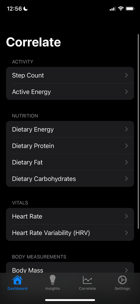
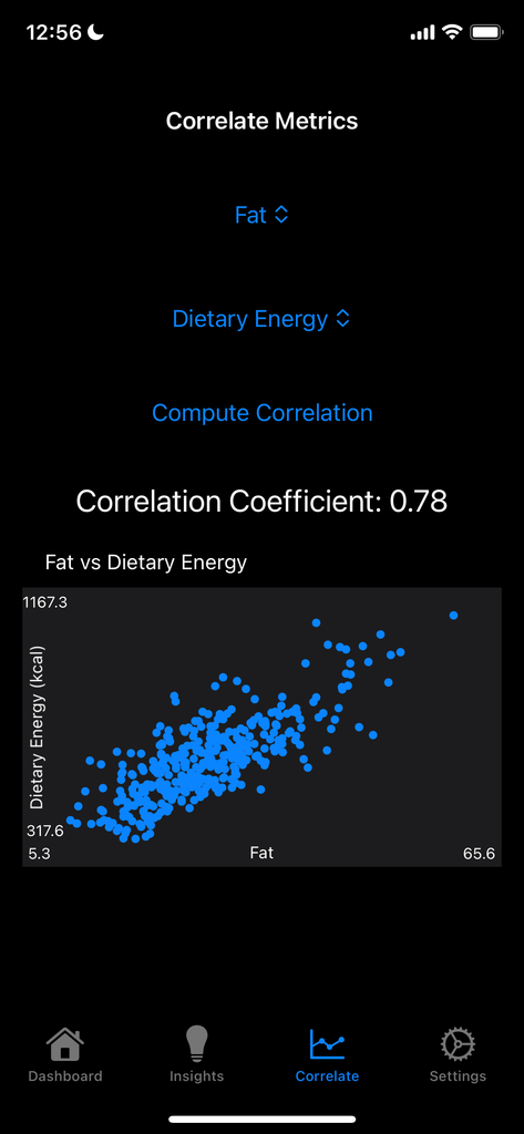
Prototype app screenshots.
What I’ve Built So Far
Building a prototype from scratch in Swift and SwiftUI, I focused on creating a solid foundation centered on statistical analysis and clean visualizations:
1. HealthKit Integration
The app plugs directly into Apple’s HealthKit API, querying and normalizing historical data across four primary categories:
- Activity: Daily Step Count, Active Energy Burned
- Nutrition: Dietary Energy (Calories), Protein, Carbohydrates, and Fats
- Vitals: Heart Rate and Heart Rate Variability (HRV)
- Body Measurements: Body Mass, BMI
2. Statistical Engine
Instead of relying on subjective impressions, the app calculates the Pearson correlation coefficient between chosen variables.
- A score closer to +1.0 indicates a strong positive relationship.
- A score near -1.0 points to an inverse relationship.
- A score hovering around 0 suggests the two metrics don’t have a direct linear relationship.
3. Scatter Plot Visualization
Numbers alone can be dry, so Correlate plots your paired data points onto an interactive scatter plot. By plotting two metrics against each other (for example, Dietary Fat vs. Dietary Energy), users can immediately spot trends, distribution clusters, and outliers at a glance.
4. Native, Clean UI
I organized the app around an intuitive four-tab structure:
- Dashboard: A bird’s-eye view of tracked metrics.
- Correlate: The custom lab where you pick two variables, calculate coefficients, and inspect plots.
- Insights: High-level takeaways derived from recent trends.
- Settings: HealthKit permissions, data preferences, and configuration.
The Road Ahead: What’s Next?
While the core correlation tool is working well, there’s still plenty to do. Here’s what’s on the horizon:
1. Time-Lagged Correlations
The biggest limitation of a simple correlation is timing. What you eat or how hard you train at 8:00 PM doesn’t just affect today; it affects your resting heart rate and recovery tomorrow. I will be introducing time-offset analysis (e.g., Compare Metric A today with Metric B tomorrow).
2. Correlation with Derivatives
Static metrics miss the momentum of your physiology. By calculating the rates of change of your time series, Correlate can answer much deeper questions:
- First Derivative: Instead of just looking at raw weight or caloric intake, correlate the rate of weight loss/gain with average daily protein intake. Or correlate the speed of heart rate recovery post-workout with sleep duration.
- Second Derivative: Detect rapid physiological shifts, such as an accelerating trend in resting heart rate over a 3-day span – often an early warning sign of impending illness, overtraining, or chronic fatigue.
- Derivative-to-Derivative Correlations: Compare the rate of change in your daily activity directly to the rate of change in your HRV over rolling windows.
3. Automated Trend Discovery
Instead of users manually selecting two metrics to check their correlation, the production app will proactively scan all available data in the background and surface discoveries:
“Your HRV drops by an average of 15% on days when your sodium intake exceeds 3,000mg.”
4. Data Privacy First
Health data is deeply personal. Correlate processes every calculation entirely on-device. No cloud databases, no analytics trackers, and no third-party data sharing – and that will remain non-negotiable.
Final Thoughts
We are living in an era where we have more personal biometric data than any generation before us, but it is still troublesome to turn that data into genuine self-understanding.
Building Correlate has been an exciting journey of bridging mobile development, statistics, and personal wellness. I’m excited to refine it further and get it into the hands of testers soon!